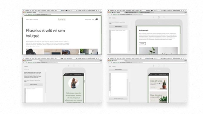
Coding for mobile in Squarespace
Learn how to fix the most common and annoying issues on your client’s Squarespace site that pop up on smaller screens, without affecting your desktop layout. Avoid “squishiness” on tablets, when using spacers to restrict the width of a block on desktop. Stop images, that you carefully sized with spacers on desktop, from blowing up on mobile screens. Avoid super narrow side-by-side layouts on tablets, by learning how to stack blocks at will. Find out how you can reorder stacked blocks on smaller screens, without affecting your desktop layout.
Learn how to fix the most common and annoying issues on your client’s Squarespace site that pop up on smaller screens, without affecting your desktop layout. Avoid “squishiness” on tablets, when using spacers to restrict the width of a block on desktop. Stop images, that you carefully sized with spacers on desktop, from blowing up on mobile screens. Avoid super narrow side-by-side layouts on tablets, by learning how to stack blocks at will. Find out how you can reorder stacked blocks on smaller screens, without affecting your desktop layout.
Learn how to fix the most common and annoying issues on your client’s Squarespace site that pop up on smaller screens, without affecting your desktop layout. Avoid “squishiness” on tablets, when using spacers to restrict the width of a block on desktop. Stop images, that you carefully sized with spacers on desktop, from blowing up on mobile screens. Avoid super narrow side-by-side layouts on tablets, by learning how to stack blocks at will. Find out how you can reorder stacked blocks on smaller screens, without affecting your desktop layout.